The Crazy Quilt Chart | Updated with 2017 Asset Class Returns

The Quilt That Keeps on Covering a Diversified Investor
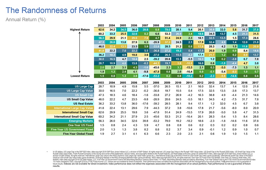
What a difference a year sometimes DOESN’T make. For several years now, we’ve been tracking the annually updated random returns that comprise what is known as “the crazy quilt chart.” Here are this year’s results:
The Crazy Quilt Chart Update
To review how the chart works, each color represents an “asset class,” or a long-term source of expected market returns. By stacking each column/year from best- to worst-performing asset class, it’s easy to see it would require some crazy logic to find a profitable pattern to pursue.
This is why we believe the only sane approach for a long-term investor is to remain broadly diversified using efficiently managed funds. That way, no matter which asset class “wins” or “loses” each year, you remain positioned to earn global market returns over time.
This year’s updated chart once again confirms this conclusion, as have the three prior versions we’ve shared here, here and here.
 SAGE Serendipity: If you are a poetry lover or aspire to be one, the PBS 12-part series Poetry In America has something for everyone. Each half hour installment includes “in-depth conversations and poetry readings with celebrities, poets, and global figures, including U2 lead vocalist Bono, shoe designer Stuart Weitzman, former United Nations Ambassador Samantha Power, U.S. Senator John McCain, hip-hop recording artist/producer Nas, singer/songwriter Regina Spektor, and more.”
 Secure Document Sharing


